 Federal Land Transfer: Beware of Politicians Bearing Maps
By Ben Long / April 3, 2017 / OUTDOOR LIFE
[dropcap]A[/dropcap]nyone who spends time afield knows how important it is to pick your maps carefully. But there is one map circulated in political circles that distort reality surrounding America’s public lands. Beware of the red map.
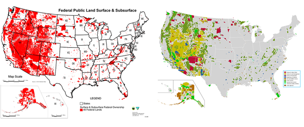
Wherever you see a politician or lobbyist who is for transferring public lands out of the federal domain, you will likely see a certain map created and is distributed by the American Lands Council, a Utah-based group that is dead-set against the federal land estate.
The map shows much of the West in blood red ink, according to ALC illustrating the vast reach of the federal government.
But that map also fails, to tell the truth. For one thing, it’s bright red color is no accident. Red is what psychologists call a “trigger” color. Red is equated with danger, risk, and warnings.
 Secondly, the land in the map is all colored the same. That gives a grossly simplistic picture of the how that landscape is managed. The map includes Yellowstone National Park, 29 Palms Marine Base, and the Pine Ridge Indian Reservation, for example. Those lands have vastly different mandates and management, but under ALC’s map, are all the same.
Compare the map with a similar one produced by the U.S. Geological Survey. It shows the same acreage, but with colors coded for military bases, wildlife refuges, Indian Reservations and national parks and forests. The brown, tan and light green of Fish and Wildlife Service, Bureau of Land Management and National Forest land tend to be of highest consequence for hunters and anglers, and are also the lands first targeted by ALC.
So if you’re researching the debate around public land transfer and see the red map, take it with a grain of salt


